CAPTURING THE PROCESS BEHIND CALICO WALLPAPER

IN THE MORNING IT’S LIKE WAKING UP TO A BEAUTIFUL SUNRISE, AND IN THE EVENING IT FEELS LIKE THE SUN IS SETTING. IT DOES HAVE AN EFFECT, PSYCHOLOGICALLY, TO BE SURROUNDED BY THIS HARMONIOUS GRADIENT OF LIGHT, ESPECIALLY LIVING IN A BUSY CITY WHERE WE HEAR TRUCKS AND SIRENS OUTSIDE EVERY DAY.


Calico’s wallpapers are better described as murals. The non repeating designs are variously too architectural, ethereal or organic to fall into a more domestic category. The special quality of their work begins with Rachel’s original large scale artworks, which often experiment with ancient patterning techniques. Nick digitally renders these panels, which overlap to create a seamless horizontal movement of texture, colour and form. Every project is treated with a labour intensive, site specific ethic as Nick and their design team plot the paper’s layout around the space’s existing architectural details.
The Brooklyn based couple have diverse backgrounds which find perfect expression in Calico. Nick studied photography and digital imaging, and has a vigorous entrepreneurial streak with a focus on interior renovation, while Rachel graduated in Sculpture from the Rhode Island School of Design, followed by a Masters and career in art therapy. Finding themselves out of work for several months in the wake of Hurricane Sandy, they began developing their first wallpaper products, which they launched at the Architectural Digest show in March 2013. Since then, their work has graced the walls of numerous high end residential and creative projects, including Friedman Benda Gallery and Casa Perfect. They routinely enlist the talents of other creatives, and have collaborated with Snarkitecture, Faye Toogood, and Ana Kraš to name a few.
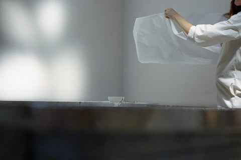
Photographs show Rachel working on one of Calico’s upcoming collections, which will be part of the brand’s new home goods studio, Cope.
CEREAL: What can you tell me about the making process for this collection?
RACHEL COPE: The original Calico collections were created with a Turkish technique using mineral pigments on a gelatinous material. This collection is different, employing a process called Suminagashi. This involves floating sumi ink and a resist fluid on water alternately to create rings, and allowing the movement of the air to determine how the ink expands and travels across the surface. After I put the ink down I blew onto the water’s surface to create different ripples and effects. We did a ‘double exposure’, printing the paper twice to achieve this beautiful double layered marbling.

CEREAL: What’s it like to work in this way?
RC: I find the Suminagashi process very therapeutic and very calm. I was playing music in the studio but realised the bass was causing the water to vibrate, so I had to create a quiet, serene environment; to the extent that I and the two designers I was working with all held our breath so we wouldn’t affect the patterning of the ink. It’s always a fun learning curve to figure out how to execute the designs on a larger scale, and the most challenging part of this collection was how to make the sumi painting fast enough, so the ink wouldn’t fall before I made the print. It’s quite a sculptural process.
CEREAL: What’s your studio like?
RC: It’s kind of a dream space. It’s in a warehouse two minutes’ walk from our home, and I can see it from our window. It has tall ceilings, a little over 4 m, and daylight pours down through the skylights. There’s definitely something important about having that ‘room of one’s own’. I can be there, alone with my thoughts, and get inspired. I don’t have to be too precious, I can make a mess and do my thing. And having a light filled space next to your home in New York is rare luxury.

CEREAL: You have said that wallpaper gives you the chance to move art beyond the frame, can you say more about that?
RC: Nick and I are both interested in creating an immersive environment that will have some kind of impact on your psychology, hopefully for the better! A good example is our Aurora collection. It has 16 different gradients, and evokes another place or time. We have the colourway Ray in our bedroom, which is orange fading into blue. In the morning it’s like waking up to a beautiful sunrise, and in the evening it feels like the sun is setting. It does have an effect, psychologically, to be surrounded by this harmonious gradient of light, especially living in a busy city where we hear trucks and sirens outside every day. The way colours combine in our collections is highly considered, and intended to be agreeable, soft and soothing.
CEREAL: Where do the ideas for the collections come from?
NICK COPE: Most collections start with the handmade process. I remember when I met Rachel, she was finishing her graduate program and was throwing out a lot of her artwork, but I found it all so interesting. It’s very much about being in the studio, exploring materials. I might influence a collection by introducing an idea, but it begins with Rachel’s experimentation and artistry, and then evolves into something for the home. I think we’re two sides of the brain at Calico. I bring the technical skill to transform Rachel’s original artwork into something architectural.

CEREAL: Your Inverted Spaces collection was created using NASA space imagery…
NC: That was a collaboration with BCSXY, an amazing design studio based in Amsterdam, that we launched in Milan in 2015. The idea of immersive spaces resonated with them, and they suggested creating a cosmic collage. It was an interesting challenge on the tech side. We were using NASA Hubble telescope images, which are actually very small, so we brought in a matte painting studio, who work on things like Game of Thrones, to render our collages in a huge size without losing detail. It was a multifaceted process and I think we arrived at something that feels organic despite being a digital artwork. It’s become one of our most popular collections.


CEREAL: The impact your designs have on a space would suggest you have a strong interest in architecture. Is that an inspiration for you?
NC: We’re inspired by designers and architects who create emotive, powerful spaces. At the moment we’re obsessed with the gravitas of Carlo Scarpa’s Tomba Brion, the playfulness of Charles and Ray Eames, and the dynamism and vibrancy of Rafael de Cárdenas. We’re perhaps even more inspired by our friends and peers in New York. Many of them either encouraged us to embark on a career in design to begin with, or help us to stay excited about our work every day. The incredible creative work of Lindsey Adelman, BDDW, and Roll & Hill bring us so much inspiration, but I’m equally impressed by the way they’ve structured independent studios that design, manufacture, market, and deliver outside the conventional modes of industry.


CEREAL: What plans do you have for the future of Calico?
NC: We have just founded our sister studio, Cope, a textiles and home goods company. We’re soon launching the inaugural textile collections, and rugs are following next spring. Rachel will keep her current art studio but we’re moving our design studio to a bigger Manhattan showroom, which will open also in the spring.
RC: The Sumi collection will be one of our new textile designs as well as a wallpaper, and there are other new designs in process. We’re printing mostly onto fine, Belgian linen and I love how the paintings and prints look on the fabric, it’s very tactile. We’re excited! It feels like a really natural next step for us.

- WORDS: Ruth Ainsworth
- PHOTOS: Matthew Johnson
- ORIGINAL POST: Readcereal

